American Roland Foods is an 80 year old importer/exporter of gourmet ingredients from around the world, catering to both retail and food service industries in the United States and abroad. Under new management, the company wanted to reinsert itself into the market with fresh strategies and a revised identity, one that reinforces the company's core strengths, differentiates them from competitors, and propels them into a drastically changing and increasingly discerning culinary scene.
As principal designer, I led this project from research to reality, generating the concept, photography, copy and layout.
The following designs garnered A 2016 Graphic Design USA award for Culinary Branding and Identity.
When Roland was merely a handful of buyers and salesmen, there was a clear personal identity attached to the name and logo. Through the years, the company has gone through many brand iterations, some designs of which still persist today. The hodgepodge lacks clarity and as Roland expanded far beyond it’s roots, with numerous employees, warehouses, and customers across the globe, these issues were never thoroughly addressed.
So, what does Roland mean today? As a major purveyor of canned and bottled goods, Roland’s clients are far reaching into all aspects of the food industry, whether it's an executive chef ordering #10 tins of roasted peppers, a distributor moving 100 cases of EVOO, or supermarket shoppers grabbing a can of artichokes off the shelf. How do these customers perceive Roland? In essence, what do they associate with the name and what do they expect from their products?
Sample Research
Clients most closely associate Roland with:
VARIETY
QUALITY
CUSTOMER SERVICE
While many chefs know Roland as a one-stop-shop for a variety of ingredients, they don't realize the real vastness of their catalog. Although they know the name, there isn't a real excitement or enthusiasm for the brand, merely another food distributor. Even with a relatively recent redesign, there was still no singular persona, one that needs to resonate with every purchase.
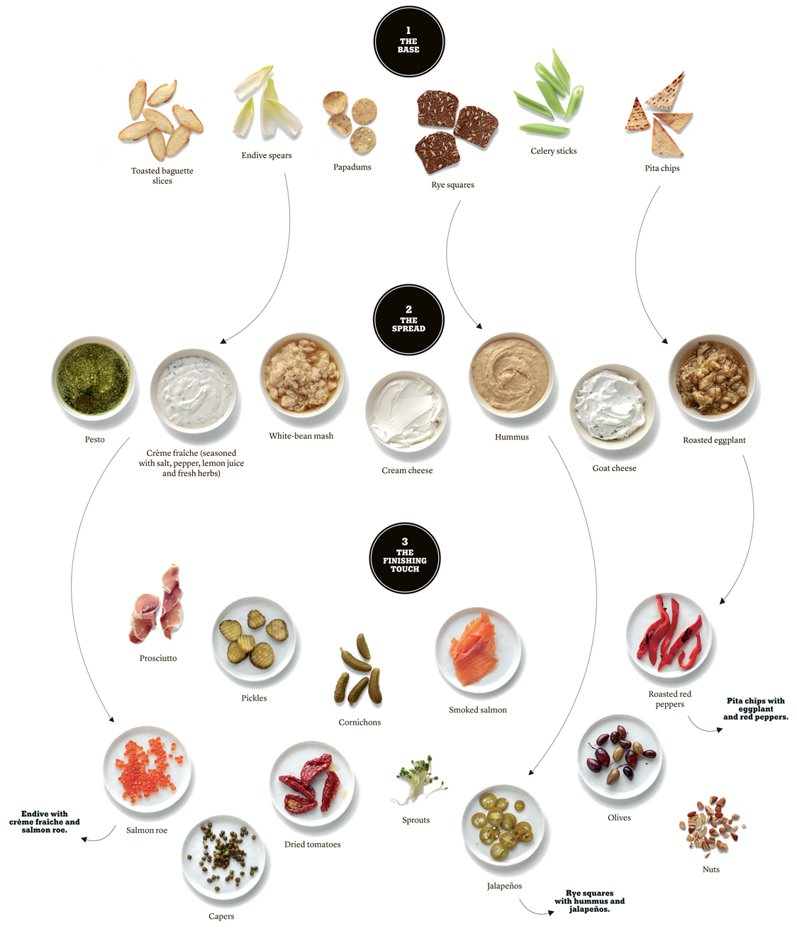
I wanted to run away from the overload of designs. Each had its own distinct characteristics and family of products. It was too much of a puzzle, and no pieces matched. So, I got rid of the labels, rid of the bottles, rid of the tins, and focused on the food itself. Using "paint swatches" as inspiration, I took the food out of the packaging and photographed each ingredient in a 4" x 4" square, creating a catalog of "food swatches". These swatches became the building blocks for a dynamic visual design, reinforcing the quality and variety that make Roland so unique.
The simple, versatile architecture is easily implemented across print and online media.
Packaging
Cleaner, more vibrant packaging exemplifies the transparency of Roland as a business. There's no bait and switch, what you see on the label is actually what you get.
PRINT AD
Catalog
Old Catalog
Previous catalogs relied heavily on packaging, showcasing the disparity of Roland's designs; a motley crew of fonts, colors and photos, with only a cumbersome logo to achieve any unity.
New Catalog
The new design for the catalog offers a cleaner look and feel, easy for the eye to navigate an overwhelming amount of ingredients. However, as freeing as it is to discard all the packaging, there is still a real necessity to show the size, weight and material for each item; fundamental information for the catalog.
Catalog Key
I designed icons to show the packaging for each item, which circumvent the need to show every jar or tin, and frees up much needed design real estate. Colors also delineate whether a product is kosher or organic, eliminating the numerous excel lists to boot.
Lobby Art
A redesign of the lobby further bolsters the new brand image, sending a compelling message to all employees and clients. It is a gateway into a newly fresh and innovative company.
Roland remains a leader among its competitors, with an architecture designed to adapt to a constantly fluctuating food industry. From in depth knowledge and understanding came a clear concept that fully personifies their core ideals. The new branding liberates their business from a history of muddled designs, rejuvenating and reasserting their long tradition as a provider of quality and variety to chefs and home cooks alike.


